Welcome to Tiffany Armenta's Cartography Webpage!!!

Link to World Map

Geography 167, Summer 2008

Hello and welcome to my webpage. It is super amateur but I kinda like it that way :)
I am a geo-nerd who gets hot for maps, so let's get down to it!
Though this isn't my hiney, I've got just as much carto-love as this chick!


Week 1: Critiquing Maps on the Internet
Here are some bad maps I found online and how to avoid the mistakes made:

Tiffany's Cardinal Rule #1: Slight displacement is ok if it is absolutely necessary but completely rearranging geographic locations is unacceptable!
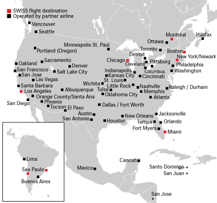
A Swiss airline company created this map and apparently the map creator was not very familiar with American cities, huh?
I consider this a bad map because most of the cities are severely displaced from where they should be. (Shouldn't Portland be near a port of some kind? And since when are there 2 cities called Sao Paulo in South America?) It seems as though this cartographer decided it was more important that the city names did not overlap than to place the cities in their actual geographic location. In addition, there are a few locations that merely have an arrow pointing to the general direction of the destination (such as San Jose, Costa Rica). Given that this map's audience is likely a Swiss person traveling to the United States, they are probably not concerned with exactLink to World Map locations; however, it would help to at least have an accurate representation of geographic features, like how coastal a city is (or someone may erroneously travel to Pittsburgh thinking they vacation on the shore of Lake Erie!)


Cardinal Rule #2: Don't overload a map with information or it may just confuse the user.
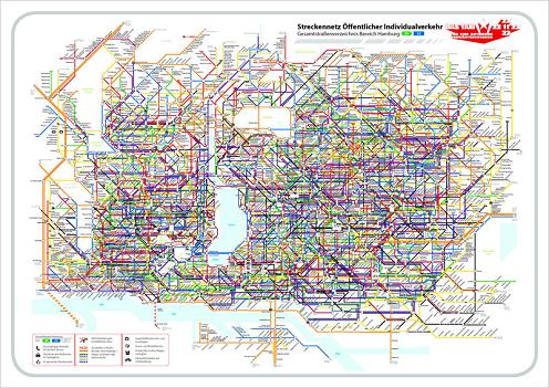
Whoa! Can you say too much information? I am still unsure whether this is a transit system map or a taxi route map for Hamburg, Germany; either way, it is probably designed to help people get around town and I can't see this map being very useful. When creating a map, you should ALWAYS consider your audience. Who exactly will be using this? How familiar are they with the focus area? Since transit maps are generally used by tourists and travelers, it is fairly safe to assume that they know little to nothing about the area. Therefore, I think it is vital to make a transit map easy to understand for even the most elementary user. This map is really intimidating due to the amount of information contained and I think it would be of better use if it were split into a few separate maps.


Cardinal Rule #3: Always properly label your maps.
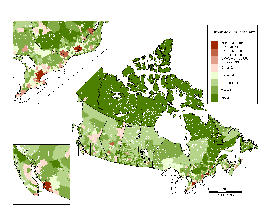
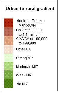
<--Enlarged Legend

As shocking as it is to believe, this is supposed to be a complete map. The site on which I found this had no additional title or information of any kind. First of all, there is no actual title to describe what kind of information the map is attempting to display. Judging by the legend title, it appears the cartographer behind this was trying to map out urban and rural areas, but it is hard to tell how the data was calculated: via population density per county? or perhaps the percentage of area that is urbanized? Although the legend should help clarify things, there are several acronyms that are not defined anywhere. Should the audience have prior knowledge of what CMA and MIZ stand for? Finally, the inset maps are randomly placed and there is no connection between the detailed maps and the inset boxes on the main map. In fact, it takes a while to realize that the detailed boxes are part of the main map and not islands or other provinces that the cartographer wanted to include.


I had to search high and low, but I was finally able to find some examples of good maps and tips on how to create them:

Tiffany's Cardinal Rule #4: Choose a good color scheme and classification method and the map will speak for itself.
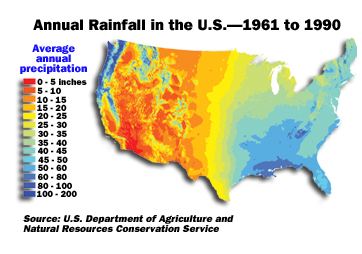
In my opinion, this is an excellent map. It has a clear, concise title that allows any literate user to understand what data is being displayed. The cartographer also chose a suitable color scheme for the data. Because this map is displaying precipitation values, blue is used to represent areas with lots of rainfall (water is often associated with blue even though it is colorless) while red represents dry areas (red is typically associated with heat). With this type of symbology, it is almost possible to ignore the values in the legend and assume that blue areas are wet and red areas are dry. I also like the classification method the creator of this map chose. Each hue is easily distinguished from the next, making the rainfall trends very noticeable throughout the country.


Cardinal Rule #5: By using simple color and size symbologies in a map, multiple messages can be sent at one time.
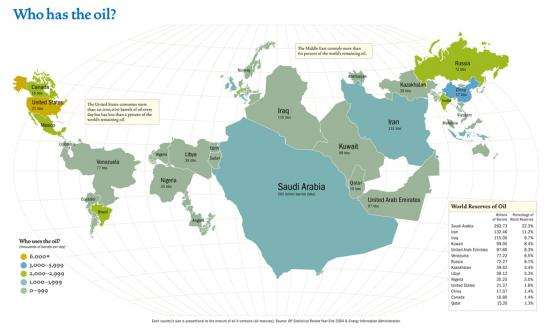
This map does a great job of showing how a single map can effectively communicate mutiple messages. First of all, the focus of the map displays which countries have the most oil worldwide based on their relative size (Saudi Arabia and other Middle Eastern countries stand out). Secondly, with a quick view of the legend, the user should be able to effortlessly understand which countries are the main oil consumers. While some mapmakers have a hard time communicating one message, such as the previous map of Canada's urbanization, this map is clear and to the point. Although I could critique this map for its political biases, I think it is very effective in telling a story without excessive text or explanations.


Cardinal Rule #6: A map is a package deal and all elements must be properly utilized and placed to make the perfect map.
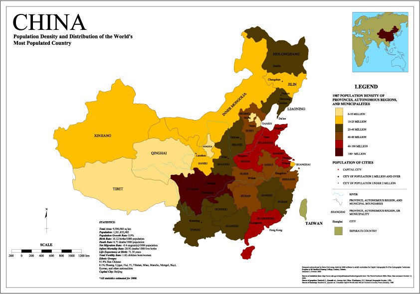
I consider this to be the best map I found on the internet because it has all the elements necessary to make a good map. It has a clear title, legend, north arrow, and scale, all of which are crucial to creating a good map. It also has a reference map to show the user where China is located if they didn't already know (lots of cartographers leave this out, but I happen to prefer to include them). Finally, this map contains something that too many cartographers omit: their data source. In my opinion, maps should never be distributed without the data source noted because then there is no way to verify the authenticity of the map. Without a data source, it is entirely too easy to skew data for the creator's purposes. I also found the general layout of this map to be well done. The focus of this map is China and notice how your eye is automatically drawn to the focus map. The creator chose colors that are easily differentiated and the legend is extremely easy to read. Overall, this map is very pleasing to the eye as it has striking colors and is well-balanced on the page. My only critique of this map is that some white space should have been removed so that the focus map could have been enlarged.
Week 2:reMapping the Metro
Official Metro Map
My New and Improved Rail Map

This week's map is my attempt to improve the official rail map provided by the Los Angeles Metropolitan Transit Authority (the reader should note that this map is not of the entire L.A. Metro system; it only displays the routes of the Metro rail and transitway).
The first aspect of the Metro Map I wanted to correct was its lack of reference points. Although a transit map is most often used by regular commuters who know exactly which route their bus takes, the cartographer should consider the infrequent user as well. In order for a transit map to be successful, even someone with limited knowledge of the area should be able to navigate the city fairly easily. Streets and highways are great reference points, and the original metro map doesn't even show a single road. So, I added the major highways of the greater Los Angeles area as an easy way to figure out where exactly the railway travels and where the stops are in relation to those highways (I did not include surface streets because I did not want to detract attention from the focus of the map). I also felt that a few well-known landmarks would not only serve as good reference points for users, but would also help tourists see the sights in L.A. So, I added some large, well-known landmarks such as UCLA, Griffith Park, and a few airports.
My second problem with the original Metro rail map is that the routes are extremely oversimplified and they are not georeferenced whatsoever. You can see that each of the lines appears to go nearly straight in whichever direction they travel, but this is not the case for most of these lines. For instance, the orange line appears to travel directly east-west, but there are actually lots of turns on its route. While I think the simplified version is fine for regular commuters, these straight lines may confuse someone new to the train. If a user were to assume that these routes follow one street the entire time, they could easily get lost and end up somewhere they did not intend to be. In order to give them their correct routes, I traced the paths from a georeferenced system map so that the turns and direction of the routes would be accurate. I then referenced the routes to the georeferenced highway layer so that each of the stops would be at its correct geographic location. The cartographer of the original map also oversimplified the train stop locations. The stops appear to be equally spaced, giving the illusion that each stop is the same distance from the next. However, they are not equidistant and this could potentially confuse riders, so I corrected this by placing each stop where it belongs in terms of geographic location.
Finally, I made adjustments to the map that would appear to many to be minor, but in my opinion, they are quite necessary. I first added more city names to the map so that riders can easily determine which line they need to take to get where they want to be. The original map had only a few areas labeled such as San Fernando Valley and Pasadena, but they were not of a consistent type (i.e. some were cities while others were only neighborhoods) and some, such as Mid-Wilshire, are only meaningful to Los Angeles residents who are already familiar with the area. Therefore, I removed some of these and instead labeled only large cities, especially those that have lots of sights. To make the map easier to read, I also removed the future transit lines as these only make the map more complex and are of no use if they're not actually in service. Although I added elements, I did think the focus of the original map was clear and I wanted to maintain this aspect. So, when I added elements like city names and highway labels, I colored them gray so that they did not take attention away from the focus, which is the Metro route. I then put neighboring counties in gray and the ocean in blue so that they became the ground while Los Angeles remains the figure. Finally, I changed the title from "Go Metro" to a more meaningful "Los Angleles Rail and Transitway" so people actually know what they're looking at.

Week 3: Making a Better Map: Classification and Animation

Classifications

Different classifications of the same data can completely alter the message a map delivers:


Natural Breaks Classification

A natural breaks classification is often considered the best type of classification system as it lumps objects together that are more similar than they are different. This provides a relatively unbiased map because it is the natural trends of the data that decides where the breaks in classes will be. As you can see in this map, the population density of California's counties vary a lot, with San Francisco County being an outlier. A benefit of the natural breaks system is that the outlier is placed into its own class, which reduces the risk of it being associated with other counties with densities that are dramatically different.

Quantile Classification

In contrast to the natural breaks classification, a quantile classification places the same number of objects in each class, thereby creating classes that have very dissimilar objects within them. For example, the most densely populated class in the quantile classification map contains counties with densities from 457-16,640 people per square mile. Obviously, these counties are not very similar in terms of density and a user could easily misinterpret the data. It appears that each county in the darkest class is highly populated, but this isn't really the case; they are actually just the 11 most densely populated out of the 58 counties. But there is an advantage to this classification, which is that temporal data can easily be compared. If someone wanted to find the 11 most densely populated counties and how they has changed over time, the quantile classification would be perfect because the same number of counties would be in each class for each dataset. This type of analysis would not be possible using natural breaks, because the breaks would change for each dataset and the classes would not be consistent.

Equal Interval Classification

An equal interval classification creates classes by dividing the range of the dataset by the number of preferred classes. This classification method also lumps very dissimilar objects together, creating a map that can easily be misread. This particular map makes California look like it is very sparsely populated, with the exception of San Francisco County, which is far from the truth. It seems to me that this grouping method would be quite effective in creating maps that send a biased message or appear to distort the truth. The advantage of equal interval data is that it is easiest to create without using a GIS of some sort, but I don't really see this as an advantage anymore considering how easy it is to make maps on computers nowadays.

Manual Classification

As the name implies, the groups of a manual classification are defined specifically by the cartographer (in this case, me!), so there tends to be a whole lot of creator bias in the classification. I like to call this map "Don't move to California". I manually defined the class breaks so that it appears that nearly every county in California is densely populated. If I were a developer in Oregon, I might use this map to persuade people not to move to California because it is so crowded, but to move to Oregon instead. This type of classification is perfect for creating propoganda maps that display actual data but display it in such a way that the message it sends is totally distorted. However, manually classified maps are not always severely biased and have the advantage that slight adjustments can be made easily. For instance, in my quantile classification, the least dense class has values between 2-19 and the next most dense has values of 20-59. To make the legend appear cleaner, a map-maker may want to change the classes to 2-20 and 21-60. This type of manual classification would only slightly adjust the class distribution and would not result in an overly biased map.


Animations

My California Population Density Animation

This animation displays the progression of population density in California's counties for the years 1970, 1980, 1990, and 2000. I chose to perform a manual classification to ensure that the values of the classes remained the same throughout the time period. I didn't want my class breaks to be arbitrary though, so I came up with a method to calculate the breaks. Because I usually prefer a natural breaks classification, I wanted to base the breaks on that somehow. So, using ArcGIS, I classified each year's data with natural breaks and 5 classes. Then, I found the average of each class break and used that value. Although this isn't a true natural breaks classification, it is the closest thing I could come up with for temporal data.

This animation clearly shows how California's population density has increased since 1970; in fact, there isn't a single county that has had a decrease in population density! The growth is obvious in both Northern and Southern California, especially in the Los Angeles county region and the San Francisco Bay area. While some of the more densely populated counties don't change much, you can see growth in surrounding counties as a result of suburban sprawl. For instance, in 1980, Orange County was pretty dense while Riverside County was in the least dense class. By 1990, Orange County moved to the most densely populated class and Riverside County also moved up in density. This population spread inland is noticeable in Northern California too and is probably a response to overcrowding and cheaper home prices in these inland counties.

Week 4: Working with Color: Qualitative Thematic Mapping

Click to see this map in PDF format

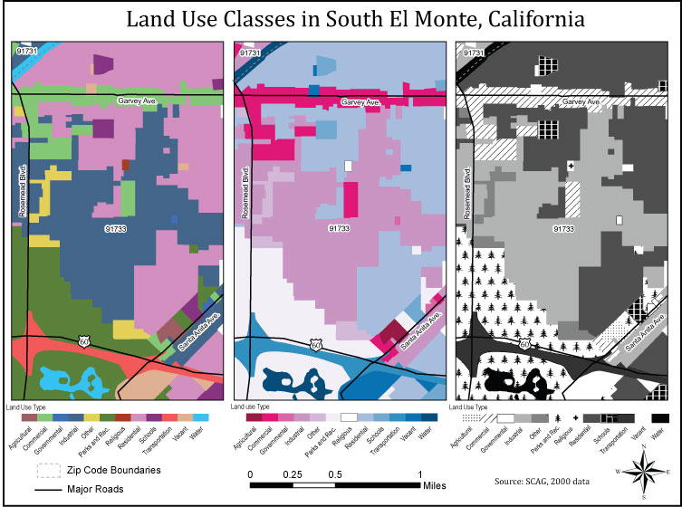
Our assignment this week was to create 3 maps displaying the same data in different color palettes. One was to be multi-color, the second two-hue, and the third in a grayscale palette. This exercise is useful because there are often color issues in regards to maps, especially when it comes to printing and publications, so it is important to know how to adjust your data to meet the needs of a client or whomever you may be making a map for.
These maps are based on land use/land cover data and I chose an area in South El Monte, California to display this qualitative data because I grew up there and was sure there would be many different classes there. This area had 13 land cover classes, but I reduced this down to 12 classes. For my purposes, I had no need for a “high density residential” and a “low density residential” class, so I combined the two by coloring them the same on each map in ArcGIS and then removing the extra class by simply deleting it in AI. I considered combining other classes as well, but did not think there were any that were similar enough to combine without skewing the data. Plus, the point of this exercise is to display lots of qualitative data and reducing the classes to too few would not be as challenging to display in the various color palettes.
The multi-color map was relatively easy to make in ArcGIS as the program already has various multi-color palettes to use. At first, I began assigning classes colors with which they are associated; for instance, I put parks and recreation in green and agriculture in beige, but then I realized I was altering the hue of the palette I had chosen. My yellow was much brighter than the rest of the colors and many of my manually adjusted colors clashed with the default colors. So, I reverted to the original palette and swapped some of the colors by entering the RGB values, but I kept the default hues. I also removed all outlines from each class because I felt that they were distracting. Many of these land use classes were divided into multiple cells, so when the outline was displayed, the class appeared sectioned and the complexity of the map increased. In my opinion, this exercise should not focus on subdivisions of classes, but general trends in the land cover, so I removed each outline.
It was much more challenging for me to decide on my palette for the two-hue map than the multi-color. In fact, I tried the various default two-hue palettes in Arc, but felt that many of the shades were too similar, so I created a palette with a little help from colorblender.com. Since I had reduced my classes to 12, I had to assign 6 shades of two different hues and I decided on a red and blue palette, since I think those colors complement each other well. Most of the shades ended up being easy to differentiate, but the lightest shades of red and blue were way too similar. Although it is not a perfect solution, I chose to give the lightest shade of blue a light gray outline, so that the class would not be confused with the lightest red shade.
Finally, the grayscale map was the toughest to create and took the majority of my time since essentially, there is only one hue to work with. Since the human eye can only detect about 5 shades of gray, I knew I would have to implement patterns, but I did not want to overwhelm the map with them. I didn’t want too many patterns next to each other, so I looked at the distribution of the classes to assess which class to leave solid and which to fill with a pattern. My final display had 5 patterned classes and 7 solid classes, and I think it is pretty easy to read. Although I had initially wanted to fill the classes with representative symbols, many classes were too small to fill this way, so only a few classes such as parks and rec and religious could have their associated patterns. Again, I utilized a gray outline to differentiate between two classes with the same fill.


Week 5: Introduction to Cybercartography: Building a Google Map Mash-up
Google Maps JavaScript API Example: Geocoding Cache
Where to eat?:

This mash-up map displays the locations of vegan and vegetarian restaurants in the Los Angeles area. I basically found the address of each restaurant and then found its latitude/longitude coordinates using www.batchgeocode.com/lookup/ and then replaced the coordinates of the capital cities with those of the restaurants. I also modified some of the code so that it is more relevant to my particular map. I changed the "Go to" command to "Where to eat?" and the "Find city" dropdown selection to "Select a restaurant". Since my target audience is a potential diner, I wanted the information displayed in the pop-up window to help decide where to eat and how to get there. So, I added the address of the restaurant and whether it is a vegan or vegetarian menu. Finally, I changed the focus of the map to be on Los Angeles and zoomed the map in because I only chose to display local veggie restaurants.

Week 6: My Final Project

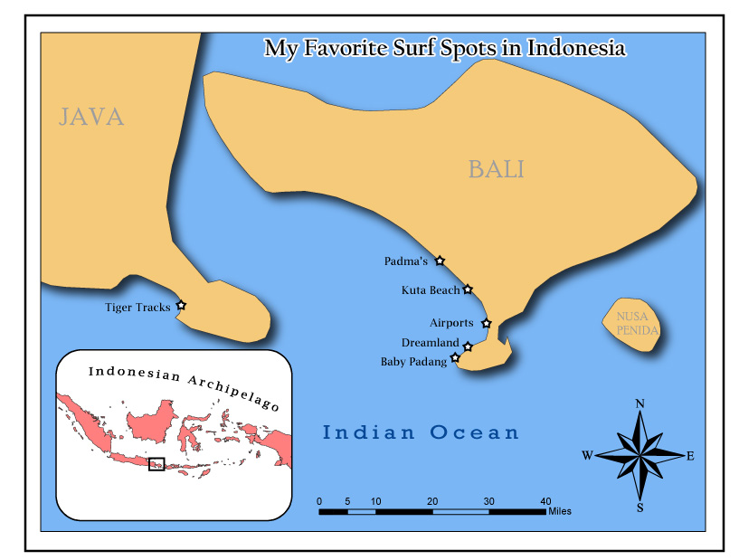
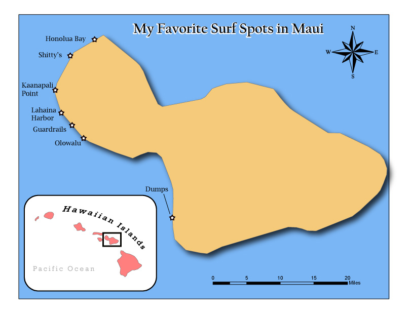
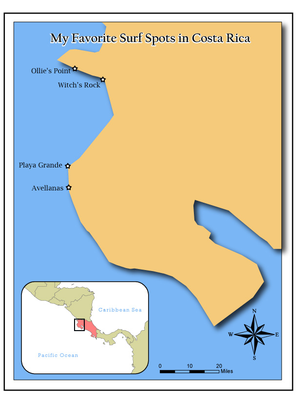
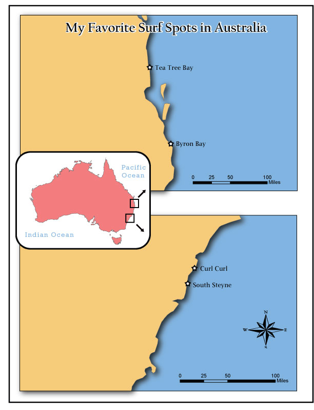
Just click a surfer icon to see maps I've made of all my favorite surf spots around the world!
Note: larger, better quality maps are also displayed on my webpage below the mash-up map.


View Larger Map